Android UI Design: Coding A Floating Bottom Navigation in Android Studio
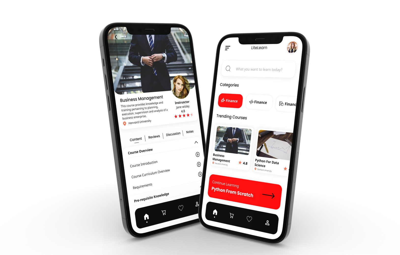
Now we are going to code a stylish black floating navigation bar for android same as given in the image below. This is the new creation I just made and very soon I am going to upload an app source code here which will include all the UI features as seen in the image below so stay tuned and subscribe to the notifications.
Here I have provided the downloads one by one to make the process of learning step by step. If you are in hurry or don't want to waste your time the full code is available at the end with everything included in it.
Table of Contents
Resources
So first we have to get some resources for our design and just like every time you can collect them from the links I provide here. but before that make a new project with bottom navigation activity so the android studio will do the rest of the logical work for us we just have to design the UI.
Background
For the background, we don't need any external resource to be downloaded. just make a new drawable resource file with root layout as shape and fill it with the code below.
navback.xml
<?xml version="1.0" encoding="utf-8"?>
<shape xmlns:android="http://schemas.android.com/apk/res/android"
android:shape="rectangle">

    <solid android:color="@color/black" />
    <corners android:radius="20dp"/>

</shape>
icons
Every UI looks good with good icons and without that it's useless. Thus we will also need some quality icons for our design, download them from below. These icons are totally free so no need to pay and if you want to appreciate my work just buy me a coffee.
Some Important Drawables
- Changing the icon when the user clicks on it o shifts to that fragment
- adding an indicator below each icon to look more attractive.
So now for changing the icon we have to make 4 XML selector files for each one you just copy the code below then read the explanation.
selector_home.xml
<?xml version="1.0" encoding="utf-8"?>
<selector xmlns:android="http://schemas.android.com/apk/res/android">
    <item android:drawable="@drawable/ic_home_filled" android:state_checked="true"/>
    <item android:drawable="@drawable/ic_home_outline" android:state_checked="false"/>
</selector>
selector_cart.xml
<?xml version="1.0" encoding="utf-8"?>
<selector xmlns:android="http://schemas.android.com/apk/res/android">
    <item android:drawable="@drawable/ic_cart_filled" android:state_checked="true"/>
    <item android:drawable="@drawable/ic_cart_outline" android:state_checked="false"/>
</selector>
selector_heart.xml
<?xml version="1.0" encoding="utf-8"?>
<selector xmlns:android="http://schemas.android.com/apk/res/android">
    <item android:drawable="@drawable/ic_heart_filled" android:state_checked="true"/>
    <item android:drawable="@drawable/ic_heart_outline" android:state_checked="false"/>
</selector>
selector_account.xml
<?xml version="1.0" encoding="utf-8"?>
<selector xmlns:android="http://schemas.android.com/apk/res/android">
    <item android:drawable="@drawable/ic_account_filled" android:state_checked="true"/>
    <item android:drawable="@drawable/ic_account_outline" android:state_checked="false"/>
</selector>
Why we need the above files
These selector files are necessary if you want to really make a good looking UI. The two lines in these files check whether the menu item is selected or not and change their icons as to the ones provided as drawable. the android:state_checked attribute checks whether the menu is clicked or not and changes the icon according to it.
Now we will need an indicator to indicate the fragment. Now make a new drawable file and copy-paste the code given below. This will make a line below the active icon/menu item.
bottom_nav_indicator.xml
<?xml version="1.0" encoding="utf-8"?>
<selector xmlns:android="http://schemas.android.com/apk/res/android">
    <item android:state_checked="true">
        <layer-list>
            <item android:gravity="bottom">
                <shape android:shape="oval">
                    <size android:height="1dp"
                        android:width="1dp"/>
                    <solid android:color="@color/white" />
                </shape>
            </item>
        </layer-list>
    </item>
</selector>
Download all the drawable with this link.
Now you have all the resources Let's start coding.
The Code
As I stated above you have to make a new project with bottom navigation activity so there is no need to code or modify the java file for the design work. You just have to add a new fragment and change some names. refer to the code provided at the end to clarify.
Creating the Menu
Now open the res>menu>menu.xml file and add the selector files we coded above as the drawable as shown in the code below.
<?xml version="1.0" encoding="utf-8"?>
<menu xmlns:android="http://schemas.android.com/apk/res/android">
    <item android:id="@+id/home"
        android:icon="@drawable/selector_home"
        android:title="Home"/>

    <item android:id="@+id/cart"
        android:icon="@drawable/selector_cart"
        android:title="Cart"/>

    <item android:id="@+id/heart"
        android:icon="@drawable/selector_heart"
        android:title="Search"/>

    <item android:id="@+id/account"
        android:icon="@drawable/selector_account"
        android:title="Account"/>
</menu>
As I said there is no need to code the java file manually if you have created the project with bottom navigation activity but add the below line to your MainActivity.java file (in the onCreate method).
bm.setItemIconTintList(null);here bm is the BottomNavigationView, I have initialized it with variable bm.
Creating the UI
Now in your activity_main.xml copy and paste the code given below.
activity_main.xml
<?xml version="1.0" encoding="utf-8"?>
<RelativeLayout xmlns:android="http://schemas.android.com/apk/res/android"
    xmlns:app="http://schemas.android.com/apk/res-auto"
    xmlns:tools="http://schemas.android.com/tools"
    android:layout_width="match_parent"
    android:layout_height="match_parent"
    tools:context=".MainActivity">

    <FrameLayout
        android:id="@+id/frame"
        android:layout_width="match_parent"
        android:layout_height="match_parent"
        app:layout_constraintBottom_toBottomOf="parent"
        app:layout_constraintEnd_toEndOf="parent"
        app:layout_constraintStart_toStartOf="parent"
        app:layout_constraintTop_toTopOf="parent" />

    <com.google.android.material.bottomnavigation.BottomNavigationView
        android:id="@+id/bottomnav"
        android:layout_width="match_parent"
        android:layout_height="80dp"
        android:layout_marginLeft="20dp"
        android:layout_marginRight="20dp"
        android:layout_marginBottom="20dp"
        app:itemIconTint="@color/white"
        app:itemBackground="@drawable/bottom_nav_indicator"
        android:background="@drawable/navback"
        android:elevation="10dp"
        app:labelVisibilityMode="unlabeled"
        app:menu="@menu/menu"
        android:layout_alignParentBottom="true" />

</RelativeLayout>
here the root layout is RelativeLayout which contains all our UI. The FrameLayout holds the fragments and below that is the bottomNavigationView from the android material library. I have provided an elevation to the bar to make it look floating and used the layout_margin attributes to leave some space at the bottom and from both sides. the app:itemBackground attribute is assigned the indicator drawable to show the indicator below the icons and the app:labelVisibilityMode="unlabeled" hides the menu item titles.

Wrapping up
Now you are ready to add a cool bottom navigation bar to your project.
Tips
You can modify the UI and make some more functionality like,
- Change the indicator shape. Try to change the indicator shape to a dot as I shown designed in the image at the top and share the code with me in the comments.
- Add some animation. You can add some animation to the bar with the help of tutorials available online.
- Try changing colours and icons. Try some other colour combinations, gradients and icons.
- Support me on buy me a coffee. Be my supporter on buy me a coffee to get new tips and tricks every month.
Download full code
download the full code to clearly understand what I have done in the tutorial or get a ready-made code to save time.

2 comments